
Typography is the art
of arranging letters and text in a way that makes the copy legible,
clear, and visually appealing to the reader. It is a core aspect of every design system, but also one of the most
fragile and overlooked—here's how we make sure our typographic systems
can stand up to change at scale.
Defining typography in a design system can be difficult because of the
biases we bring
along. In word processors, design programs, and even CSS, we’re
used to defining typography including everything from weight to
line-height to color to spacing.
Here are some type of trending
Type face:
A typeface (or font family) is a design of letters, numbers and other symbols, to be used
in printing or for electronic display. There are three main categories of typefaces: serif, sans serif, and script.
Typeface refers to a group of characters, letters and
numbers that share the same design.
What is typeface example?
For example Garamond, Times, and Arial are typefaces. Whereas font is a specific style of typeface with a
set width, size, and weight.
Size:
The point
is the smallest unit of measure in Typography. It
is used for measuring font size, leading, and other
items on a printed page. The size of the point has
varied throughout printing's history.
The actual physical size of a point has varied throughout
history, but since the mid-1980s, one point is equivalent
to 1/72nd of an inch in print.
Weight:
Weight refers to the relative thickness of a font's
stroke. A typeface can come in many weights; and four to six
weights is a typical... Weight refers to the relative
thickness of a font's stroke. A typeface can come in
many weights; and four to six weights is a typical
number available for a typeface.
The standard font weight is 400.
Common weight name and mapping:
Value
Common weight name
400 Normal
500 Medium
600 Semi Bold
700 Bold
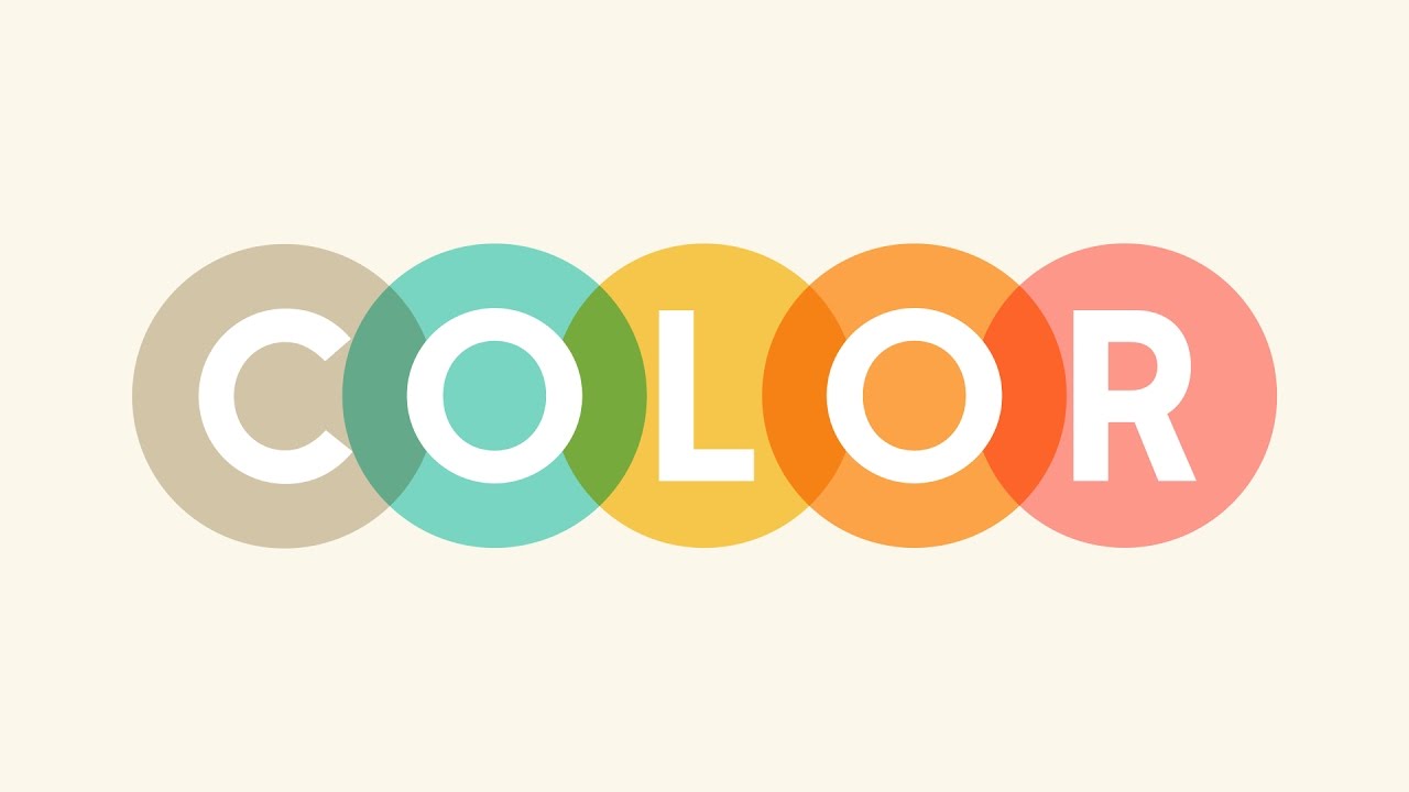
Color:
In typography, color
refers to the overall presence of type on a page its lightness and darkness compared to the negative space
rather than literal color in the sense of a palette or
swatch.

Clean and
minimalist, white backgrounds with black text offer optimal readability and a modern aesthetic. A
softer alternative to black, dark gray provides subtlety
while maintaining readability. Light gray text can create
a gentle and harmonious look when paired with darker
backgrounds.
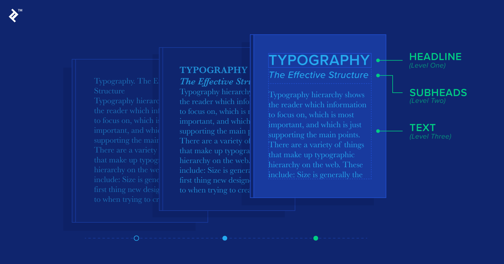
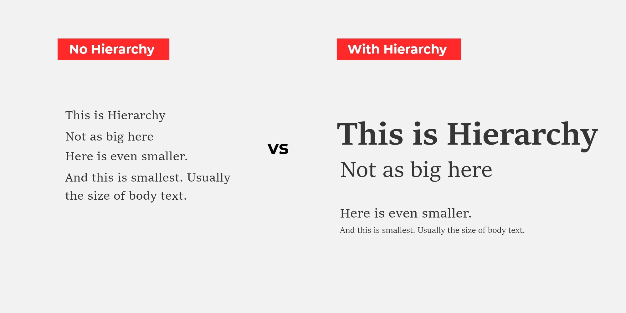
Visual Hierarchy:
Three major sections make up a visual hierarchy of
text. These are the headline, subheading, and body which make the design more visually appealing and
easier to navigate. This allows readers to scan quickly
for relevant information. I hope you like my article, if yes then follow my blog. Thankyou.😄


No comments:
Post a Comment